Assessment |
Biopsychology |
Comparative |
Cognitive |
Developmental |
Language |
Individual differences |
Personality |
Philosophy |
Social |
Methods |
Statistics |
Clinical |
Educational |
Industrial |
Professional items |
World psychology |
Statistics: Scientific method · Research methods · Experimental design · Undergraduate statistics courses · Statistical tests · Game theory · Decision theory
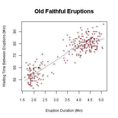
Waiting time between eruptions and the duration of the eruption for the Old Faithful geyser in Yellowstone National Park, Wyoming, USA.
A scatterplot, scatter diagram or scatter graph is a graph used in statistics to visually display and compare two or more sets of related quantitative, or numerical, data by displaying only finitely many points, each having a coordinate on a horizontal and a vertical axis.
The scatter diagram is one of the seven basic tools of quality control, which include the histogram, Pareto chart, check sheet, control chart, cause-and-effect diagram and flowchart.
For example, to study the effects of lung capacity on the ability to hold one's breath, a statistician would choose a group of people to study, and test each one's lung capacity (first data set) and how long that person could hold their breath (second data set). They would then set up the data in a scatter plot, assigning "lung capacity" to the horizontal axis, and "time holding breath" to the vertical axis. A person with a lung capacity of 400 cc who held their breath for 21.7 seconds would be represented by a single dot on the scatter plot at the point (400, 21.7) in Cartesian coordinates. The scatter plot of all the people in the study would enable the statistician to obtain a visual comparison of the two sets of data, and help to determine what kind of relationship there might be between them.
Scatter plot shows the position of all of the cases in an x-y or x-y-z coordinate system. The relationship between interval variables can be identified from scatter graph. A dot in the body of the chart represents the intersection of the data on the x and y axis.
One advantage of a scatterplot is that it does not require a user to specify dependent or independent variables. Either type of variable can be plotted on either axes. Scatterplots represent the association (not causation) between two variables.
A scatterplot can show three relationships, a positive (rising), negative (falling), and no relationship, which is varied. If the downward sloping pattern of dots is from upper left to lower right, it suggests a negative correlation between the variables being studied. If the downward slope is from upper right to lower left, it suggests a positive correlation. A line of best fit can be drawn in order to study the correlation between the varibles. An equation for the line of best fit can be calculated by using the correlation coefficient.
(In probability theory and statistics, correlation, also called correlation coefficient, indicates the strength and direction of a linear relationship between two random variables. In general statistical usage, correlation or co-relation refers to the departure of two variables from independence, although correlation does not imply causality. In this broad sense there are several coefficients, measuring the degree of correlation, adapted to the nature of data.
A number of different coefficients are used for different situations. The best known is the Pearson product-moment correlation coefficient, which is obtained by dividing the covariance of the two variables by the product of their standard deviations. Despite its name, it was first introduced by Francis Galton.)
- de:Streudiagramm
- ja:散布図
| This page uses Creative Commons Licensed content from Wikipedia (view authors). |